
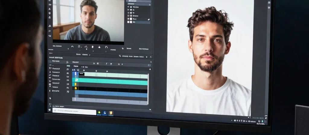
Shrink a thumbnail until it is about the size it might appear on a phone. If the subject becomes hard to identify, or the image depends on tiny text to make sense, the idea needs simplifying. The title and thumbnail have different jobs, but they should leave the viewer with one consistent expectation.
Give each element a clear job
Let the thumbnail communicate visually: a close crop of the relevant interface, a clear before-and-after, or one recognizable object can give the eye something to read quickly. Use the title to supply the detail the image cannot, such as the tool, task, or audience. For a tutorial, a concrete promise like “Clean up noisy dialogue in Audition” is more informative than a vague claim that the result is amazing.
Design for a small screen
Build the composition around one focal point and check that it holds up at a small size. Strong separation between the subject and background can help, while competing labels, decorative marks, and several tiny screenshots make the image harder to parse. If you use text in the thumbnail, treat it as a short visual cue rather than a second headline.
Read test results with care
When thumbnail testing is available in your YouTube Studio, use it to compare versions that make a meaningful visual change. Keep notes about what changed and avoid treating a single result as a rule for every future upload. Click-through rate is most useful when read alongside the video's traffic source and what viewers do after clicking; a click alone does not show whether the video fulfilled its promise.